

Website User Journey in Healthcare: A Practical Guide

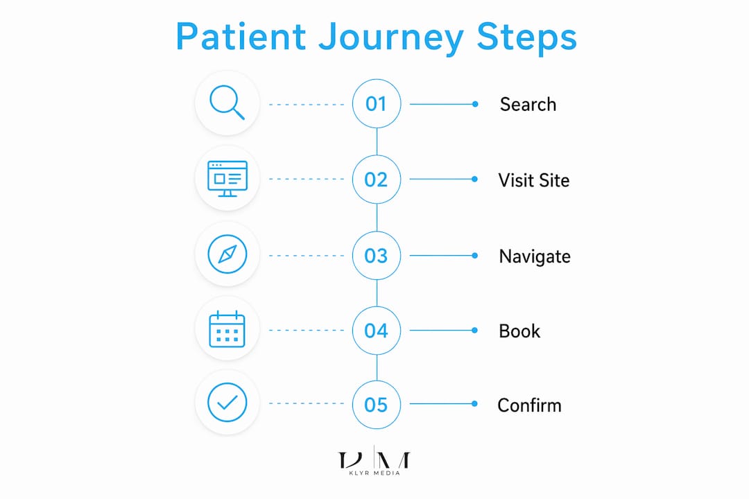
The website user journey in healthcare is defined as the complete sequence of steps a patient takes on a healthcare organization’s website to accomplish a specific goal, such as booking an appointment, finding a provider, or accessing health information. Every click, page view, form submission, and navigation choice is part of that journey. The industry term for this process is “patient journey mapping,” and understanding it is the foundation of any serious healthcare digital experience strategy. The health-tech sector is projected to reach USD 1,305.1 billion in revenue by 2030. That scale makes optimizing the digital patient experience not a nice-to-have, but a business requirement.
What is website user journey healthcare, and why does it matter?
A patient’s website journey is not just a UX concept. It is a direct reflection of how well your organization serves people before they ever walk through the door. When a patient lands on your site, they are often anxious, time-pressed, and looking for a clear next step. If your website makes that step hard to find, they leave. They do not call. They do not come back.

Patient flow is the core concept here: how patients move sequentially through digital touchpoints rather than visiting isolated pages. A patient searching for a flu shot does not just want information. They want to find a location, check availability, and book an appointment in one connected flow. If any of those steps breaks down, the entire journey fails.
Healthcare websites carry higher stakes than retail sites. Patients are making decisions about their health, not buying shoes. That means trust, clarity, and speed are non-negotiable at every stage of the online experience.
How to map and analyze the patient website user journey
Mapping the patient journey starts with understanding what patients are actually trying to do, not what you assume they want. Most healthcare administrators design websites around organizational structure, not patient goals. That is the first mistake to fix.
A practical mapping process follows four steps:
- Define your patient segments. A 65-year-old managing a chronic condition has different digital needs than a 30-year-old booking a routine checkup. Segment by age, health literacy, and visit purpose before mapping anything.
- Audit your current digital touchpoints. List every page, form, portal, and scheduling tool patients encounter. Note where each one starts and ends, and identify where handoffs occur between systems.
- Collect real behavioral data. Use session recording tools and analytics to see where patients drop off. Combine that with patient interviews or post-visit surveys to understand the “why” behind the numbers.
- Apply the Double Diamond framework. The Double Diamond model uses four stages: Discover, Define, Develop, and Deliver. It has been applied directly to healthcare digital platforms, including ICU telemedicine systems, to structure journey design from problem identification through tested solutions.
Empathy maps are a useful companion to journey maps. They capture what patients think, feel, see, and do at each stage. When you combine empathy maps with behavioral analytics, you get a full picture of friction points that pure data alone cannot reveal.
Pro Tip: Involve both clinicians and patients in usability testing sessions. Clinicians catch workflow gaps that administrators miss, and patients surface confusion that internal teams have become blind to.
What makes healthcare user journeys uniquely difficult?
Healthcare websites face barriers that no retail or service site encounters. These barriers are structural, not cosmetic, and they require specific solutions.
- Health literacy gaps. Approximately 36% of U.S. adults have basic or below-basic health literacy. Patient-facing content must target a 6th-to-8th grade reading level to reach the full patient population, not just the most educated visitors.
- Anxiety and privacy concerns. Patients searching for sensitive health information are already on edge. Confusing navigation or unexpected data requests amplify that anxiety and trigger drop-off.
- Fragmented digital ecosystems. Most healthcare organizations run multiple disconnected systems: a main website, a patient portal, a scheduling microsite, and a telehealth platform. Patients experience these as one journey, but the technology treats them as separate.
- Cognitive load for patients with complex needs. A patient managing multiple conditions, multiple providers, and multiple medications cannot process a dense, jargon-heavy website. Cognitive overload leads directly to abandoned sessions.
- Broken handoffs between channels. Handoffs between digital channels are the most common failure point in healthcare journeys. A patient who completes an online booking form and then gets told to call the office to confirm has just experienced a broken journey. Trust erodes immediately.
“Healthcare patient journey mapping must account for anxiety, drop-offs, and privacy constraints, not just the ideal path. Patients rarely follow the happy path, and designing only for that scenario leaves the majority of your patients underserved.”
Many healthcare digital projects fail to achieve adoption because teams skip end-user testing and misread clinical workflows. That is not a technology problem. It is a process problem, and it is fixable.
Best practices for optimizing healthcare website user journeys
The goal of optimizing healthcare websites is not a prettier design. It is a cleaner path from patient need to completed action. These strategies produce measurable results.
Simplify navigation to single-action flows
Reducing booking and intake flows to one primary action per screen significantly improves completion rates. Every additional step or decision on a single screen reduces the chance a patient finishes the task. Apply this principle to appointment scheduling, prescription refill requests, and new patient registration.
Write for the patient, not the organization
Replace clinical terminology with plain-language equivalents. “Otolaryngology” becomes “ear, nose, and throat.” “Prior authorization” becomes “insurance approval.” Use visual aids, icons, and progress bars to reduce reading load and signal to patients that they are moving forward.
Maintain consistency across all digital properties
Patients should not feel like they have left your organization when they move from your main website to your patient portal. Consistent branding, navigation patterns, and language across all properties reduces cognitive friction and builds trust.
| Strategy category | Primary impact |
|---|---|
| Single-action screen design | Higher appointment completion rates |
| Plain-language content | Broader patient reach across literacy levels |
| Cross-property consistency | Reduced drop-off at channel handoffs |
| Real patient usability testing | Fewer post-launch UX failures |
| Continuous governance monitoring | Proactive issue detection before patients notice |
Test with real patients, not internal teams
Internal teams are too familiar with the system to spot confusion. Recruit patients from your actual population, including older adults and patients with lower digital literacy, to test every critical flow before launch and after major updates.
Pro Tip: Run usability tests on mobile first. A significant share of patients access healthcare websites on smartphones, often in waiting rooms or during stressful moments. If the mobile flow breaks, the desktop version’s quality is irrelevant.
Healthcare website design that converts patients prioritizes function over form at every decision point. Aesthetics matter, but a beautiful site with a broken booking flow loses patients every day.
How do you measure the success of patient journey improvements?
Measuring journey health requires tracking specific metrics, not just overall traffic or page views. The right metrics tell you where patients succeed, where they struggle, and where they disappear.
Key metrics to track:
- Appointment conversion rate. The percentage of patients who start the booking flow and complete it. This is your primary indicator of journey health.
- Drop-off points by page. Identify which specific pages cause patients to leave. High drop-off on a scheduling page signals a friction problem, not a traffic problem.
- Task completion rate. Ask patients after a session whether they accomplished what they came to do. This captures failures that analytics alone cannot see.
- Time on task. If patients take significantly longer than expected to complete a booking or find information, the navigation structure needs work.
- Patient satisfaction scores tied to digital interactions. Post-visit surveys that include questions about the online experience connect journey quality to overall care perception.
Continuous governance and monitoring across all digital properties can detect UX, accessibility, and performance issues before patients encounter them. Automated monitoring flags broken links, slow load times, and accessibility failures in real time. That means your team fixes problems proactively instead of learning about them from frustrated patients.
Journey health should be a leadership KPI, not just a web team metric. When administrators and clinical leaders see appointment conversion rates alongside clinical outcomes, they make better investment decisions about digital infrastructure.
Key Takeaways
The patient website user journey is the single most important factor determining whether a patient engages with your practice online or walks away to a competitor.
| Point | Details |
|---|---|
| Define the full journey | Map every touchpoint from first search to completed appointment, including handoffs between systems. |
| Use the Double Diamond model | Apply Discover, Define, Develop, and Deliver stages to structure patient journey design. |
| Write at the right reading level | Target a 6th-to-8th grade reading level to reach the 36% of U.S. adults with limited health literacy. |
| Design for single actions | Limit each screen to one primary task to increase completion rates across booking and intake flows. |
| Monitor continuously | Automated governance tools catch UX and accessibility failures before patients experience them. |
Why journey mapping changed how I think about patient engagement
Most healthcare administrators I talk to think of their website as a brochure. They measure success by how it looks, not by how it performs. That framing is the root cause of most digital patient experience failures I have seen.
When you start mapping the actual path patients take, including the wrong turns, the dead ends, and the moments they give up and call the front desk instead, you stop thinking about pages and start thinking about outcomes. That shift is significant. A patient who cannot find your online booking form does not just fail to book online. They call, wait on hold, and sometimes give up entirely. That is a real appointment lost, not a UX abstraction.
The practices that get this right share one habit: they treat the patient website journey as a clinical workflow, not a marketing asset. They involve front desk staff, nurses, and patients in testing. They track drop-off rates the same way they track no-show rates. They assign ownership to someone who reports to leadership.
Digital equity is the piece most organizations still ignore. Patients with lower digital literacy, older adults, and patients with disabilities experience your website differently than your internal team does. Designing only for the tech-comfortable majority means failing a substantial share of your patient population. That is both a care quality issue and a business issue. The organizations that close that gap first will earn the loyalty of patients that others keep losing.
— Opinly
Klyrmedia builds healthcare websites that patients can actually use
If your website is losing patients before they book, the problem is usually the journey, not the traffic.
Klyrmedia specializes in HIPAA-compliant web design for independent pharmacies, medical clinics, and healthcare practices across the United States. Every site Klyrmedia builds is designed around patient flow, not organizational charts. That means clear navigation, single-action booking flows, plain-language content, and full HIPAA compliance built in from the start. The result is a website that converts visitors into booked patients and keeps them coming back. If you are ready to fix the leaks in your digital patient journey, Klyrmedia is the place to start.
FAQ
What is a website user journey in healthcare?
A website user journey in healthcare is the step-by-step path a patient takes on a healthcare organization’s website to accomplish a goal, such as booking an appointment or finding a provider. It includes every click, page view, and form interaction from arrival to completion.
Why does patient journey mapping matter for healthcare websites?
Patient journey mapping identifies where patients drop off, get confused, or abandon tasks on your website. Fixing those friction points directly increases appointment conversion rates and patient trust.
What is the biggest failure point in healthcare digital journeys?
Handoffs between digital channels, such as moving from a website booking form to a phone call, are the most common failure points. They break the patient’s flow and erode trust immediately.
How do you measure healthcare website journey success?
Track appointment conversion rates, drop-off points by page, task completion rates, and time on task. These metrics show where the journey works and where it fails, giving your team specific problems to fix.
What reading level should healthcare website content target?
Patient-facing content should target a 6th-to-8th grade reading level. Approximately 36% of U.S. adults have basic or below-basic health literacy, so complex medical language excludes a significant share of your patient population.

